Tuesday, December 2, 2014

Song of Storms

It's a much-needed rainy day here in Los Angeles - it's been coming down all day! - so what better time to share this delightful piece of artwork I found on the interwebs a little while ago.


I don't often share / showcase individual pieces of art by other artists on the blog, but this one really spoke to me for some reason. I love the style, the lighting / mood, the color palette, all the little narrative elements. It's an illustration that rewards looking closely. The artist is Matt Rockefeller, a recent graduate of the Maryland Institute of Art.

CTN recap coming soon!

© Gina Florio 2014

Tuesday, November 18, 2014

CTN Expo 2014 - I'm Off to See the Wizard


Hey everyone!

Just a quick note to say I'll be at CTN Animation Expo all 3 days this weekend! Besides going to portfolio reviews, there's a great lineup of workshops and panels that I plan to attend - notably, an "all-star" character design panel helmed by Chris Oatley, Brett Bean, Stephen Silver, Tony Siruno, and Jeff Wamester. I'm also excited to visit the many artist booths and meet some of my favorite artists like James Gurney, Ty Carter, Mingjue Chen, Cory Loftis and more. I'll also be going to a "Drawing Party" opening night event at the Silver Drawing Academy on Thursday night. It promises to be a busy but exciting weekend!

I've been hard at work on a new chunk of portfolio pages which I'll put up soon!

If any friends/readers will be in attendance let me know! Hope to see you there!

© Gina Florio 2014

Tuesday, October 28, 2014

New Portfolio Pages

I'm currently keeping my head down working on a portfolio for this year's CTN Animation Expo, which is happening at the end of November. However, the deadline to submit a 12-page portfolio for their specialized recruitment event was today, and I'm happy to say that I just submitted.

After two years of taking classes and going to countless workshops and art events, it's a bit surreal to be finally submitting my portfolio to actual animation and game studios. No matter what happens, I'm proud of the work that I've done and the skill level I've achieved, and I'm excited for whatever the future holds.

Here's some of the recently completed portfolio pages I made to go along from my work from Jose Lopez's Character Design class. You can view my entire portfolio by clicking on the tab above, or just clicking here.


I had a lot of fun with these if you can't tell! Props = good times. Although I am officially over attempting to do solid linework using a tablet... yeesh... whose idea was that.

© Gina Florio 2014

Thursday, October 9, 2014

School's Out: Character Design wrap-up

I recently completed my term in Jose Lopez's Character Design class at the Concept Design Academy. I relished the opportunity for a class that built on the foundational skills I had already gained, but also pushed me to think about how to best communicate the things I had in my imagination. I already see such a difference in my sketches from before the class and after. Here's my compilation of work for the class.


I've now been continually taking classes for 2 years straight. When I started going to CDA, I wrote down the classes I wanted to take on a post-it note, stuck it on my computer monitor, and have been crossing them off one by one as I go. 'Character Design' was the final class, and I had a real sense of accomplishment when I recently crossed it off, and was left with a 2-year-old post-it note full of dark lines.

I've decided for the first time in two years to not take another class at CDA this upcoming winter semester. My reasoning for the break is twofold: firstly, I'm not gonna lie, I'm a bit burnt out. Character Design was the 8th class I've taken. The classes themselves are only 3-4 hours a week, but combined with driving and homework, it's been a huge time commitment for the past 2 years on top of already having a 50+ hr/week job. And secondly, I'm preparing my portfolio for CTNx this year and I need all the art-time I can get to go towards that effort.

Unfortunately this also means I won't be taking a class again for at least a year, which is strange to think about - CDA feels like a permanent part of my life at this point. But next spring we're doing a fair amount of traveling, and next summer I will be swamped in wedding planning hell, drowning in tulle and sparkles (there are worse ways to go). In the meantime though, I'm planning on taking advantage of the many online learning options that are available in this golden age of internet education, particularly Chris Oatley's self-paced Magic Box course.

At the end of the day, all I really have to say is this: I don't kid myself about the reasoning behind why I've improved so much as an artist over the past 2 years. I've worked hard. But the only reason I've gotten to where I am is because I've benefited from quality education. My unparalleled teachers and incredible fellow students have given me invaluable feedback and pushed me in ways that I never thought possible. If it weren't for them and for CDA, I'd still be buying new pens thinking *this* is the one that will make me a good artist, and doodling dejectedly in spiral bound sketchbooks for 15 minutes before giving up. I'm no Rembrant. But I have more confidence in myself as an artist with each passing day, and that growing confidence has been a really great joy in my life.

© Gina Florio 2014

Friday, October 3, 2014

Friday Fun: Musical Chairs

Steve Jobs famously said "Creativity is just connecting things." So, what happens when you connect J-Pop with Heavy Metal music?

The answer... Babymetal. I like to call this the internet's ultimate "Wait for it..." video.


In the same vein, musical group Gangstagrass has been combining bluegrass and rap. (They were nominated for an Emmy for "Long Hard Times to Come," the opening theme song for FX's Justified.)


I love both of these ideas in that they take two seemingly diametrically opposed musical genres and mix them together, with - in these examples - great results.

Happy Friday!

© Gina Florio 2014

Thursday, October 2, 2014

Teaser Trailer for Pixar's New Film

The teaser poster and trailer for Pixar's new film, 'Inside Out,' has been released!


I typically try not to watch trailers at all since they tend to give too much away, but teasers are usually fine. Of course, there's not that much to say about it yet either, except that this looks intriguing and that the premise is pretty bold - I'll be curious to see how they pull it off for an entire movie. Here's the film's writeup from Pixar:

Growing up can be a bumpy road, and it’s no exception for Riley, who is uprooted from her Midwest life when her father starts a new job in San Francisco. Like all of us, Riley is guided by her emotions – Joy (Amy Poehler), Fear (Bill Hader), Anger (Lewis Black), Disgust (Mindy Kaling) and Sadness (Phyllis Smith). The emotions live in Headquarters, the control center inside Riley’s mind, where they help advise her through everyday life. As Riley and her emotions struggle to adjust to a new life in San Francisco, turmoil ensues in Headquarters. Although Joy, Riley’s main and most important emotion, tries to keep things positive, the emotions conflict on how best to navigate a new city, house and school.

'Inside Out' is due in theaters June 19, 2015.

© Gina Florio 2014

Friday, September 26, 2014

Expectation vs. Reality

Concept artist Matt Kohr's free digital painting resource ctrlpaint.com is a site I go back to again and again when I'm using Photoshop artistically. His instructional videos are clear, concise and entertaining, and extremely well categorized by topic. However, he also makes videos with advice about the less concrete aspects of being an artist; the psychological side. This recent post was a video I really could've used when I was first getting back into studying art again.

Please note: this is not the video. Clicking on this picture will not do anything. Sorry.

Right now it seems like he's not allowing people to embed this video which is a real bummer BUT I encourage you all to click this link and read his original post where you can also see the video.

Until recently, I was constantly beating myself up over my art not turning out how I wanted or expected it to. But at some junction I just got really tired of it. What's the point? I'd rather be happy with the competence I've already attained and comfortable in the knowledge that I'll continue to level up my skill as long as I keep at it. I still work hard but I've been giving myself a bit more of a break instead of persistently driving myself crazy with negative thoughts. Negative thoughts cause stress and stress uses up energy and I need that energy to get shit done! So be good to yourselves. :)

Have a great weekend everyone! I'm going apple and pumpkin picking this weekend which I am very excited for. Here's a Happy Fall sketch!


© Gina Florio 2014

Tuesday, August 26, 2014

Real-Time Facial Projections


I don't think there's any better way to say this than: this shit be cray.

© Gina Florio 2014

Monday, August 4, 2014

On Fear


(Why yes, I did just finish 'Dune' for the first time, how did you know?)

© Gina Florio 2014

Friday, August 1, 2014

People Watching

James Gurney has a great series of posts about plein-air painting going on his blog, Gurney Journey. The more popular posts deal with the people who come up to you while you're drawing in public.

Image credit: James Gurney

Curious Spectators Part 1: The Problem
Top Ten Ways to Deal with Curious Spectators

I'm always friendly, but I'll admit, I really hate people watching me draw or paint. My least favorite experience was with a 12-year-old girl who made me reconsider my condemnation of violence against children. Watercolors apparently come really easy to her and she made it her life's duty - for a full half hour! - to tell me how to mix my paints. There was also a guy who complemented me on the houses in my painting. There were no houses in the painting.

Aside from these two encounters, everyone who's ever come up to me has been overwhelmingly thoughtful and respectful. But it just takes me out of the zone completely when I know someone's watching. And I have to admit that the question "Are you painting?" is hilarious the first time and less hilarious the next 300 times.

Someone responded to the post with this quote which I decided I'd share. I think it sums me up better than any other quote I've ever heard.


© Gina Florio 2014

Monday, July 21, 2014

Character Design - misc exercise drawings

One of my favorite parts of the character design class that I've been taking (which I wrote about yesterday) has been the in-class exercises. They've been one of the ways I can tell I'm more cut out for design than storyboarding. When my Story Development teacher would say "time for an in-class exercise," I would immediately break out in a cold sweat. When Jose calls for one, I get excited. I really like challenging my brain to do a design in under 10 minutes. It's just plain fun.

The first exercise we did was to just call out random words. Jose would put 2 words together and we'd have to design something to that effect.

"Pirate Batman"


"Octopus Lawyer"


"Alcoholic Clown"


"Rocket Girl"


I really wish I could show you some of my classmates' design solutions for these - there were some seriously brilliant ones. I remember my favorite alcoholic clown having whisky coming out of a squirty flower pin on his lapel. The fun of it was really seeing all the different designs together after we were done. 

The second exercise was to design a character from a shape that the teacher drew up on the board. We could add to the shape, but ultimately it had to be the prominent mass of a character.


Finally, something I drew in class during the lecture. I used to draw in my notebooks all the time when I was in grade school. It got me in trouble because I never paid attention. Not at art school...


P.S.: Dawn of Planet of the Apes was really, really good.

© Gina Florio 2014

Friday, July 18, 2014

Character Design with Jose Lopez

My latest class at the Concept Design Academy is Character Design with Jose Lopez. We're about halfway through the class.

I've been working towards taking this class for two years. When I first got interested in concept art, I wanted to jump immediately to character design, but I knew I wasn't ready - I had to study the fundamentals first. This is a complete list of the classes I have taken so far, in this order:

VisCom 1
Perspective
Landscape Painting
Analytical Figure Drawing
Intro to Digital Painting
Intro to Story Development
Figure Invention for Animation

I took Story Dev and Fig Invention during the spring semester because I was thinking about pursuing a track as a storyboard artist. I subsequently realized that I did not enjoy storyboarding at all - but I don't regret taking those classes. 

Even if most of these classes weren't directly related to character design, I've learned something and made artistic progress in every single one. I don't miss struggling with oil paints in the hot sun. But the landscape painting class made me a much better artist because I learned to pay attention to the big picture, the broader statement of the image. I don't miss calculating precisely at which angle a generic box is casting a shadow. But learning perspective paid off greatly during my character design homework this week when I had to do turnarounds and calculate precisely where my characters' feet would be on the ground.

I would have taken more classes before character design if I had had more time - I particularly would have loved to take Animal Anatomy, and the more advanced Head / Figure Drawing class. But I've been studying those things on my own on the side as I go along. And I knew my fundamental drawing skills were getting strong, but I was sorely lacking in my design skills. I felt ready to tackle a design course.

For Character Design, we were supposed to come up with a story (or choose a classic fairytale) and do designs for 4 characters of our choosing - a hero, a love interest, a villain, and a sidekick. We started off with LOTS of thumbnails, and finally it came down to doing a final design and turnaround for 2 of them.

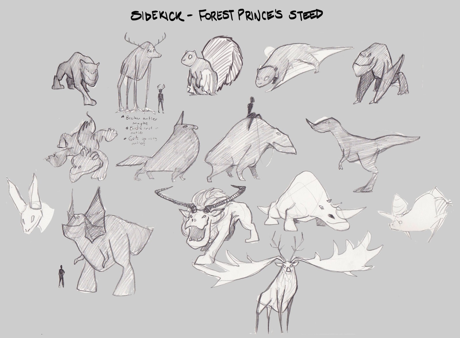
My characters are Riva, a scrappy cartographer's daughter, Altus, the forest prince, Unnamed Villain, the mayor of Riva's town, and Altus's steed, a creature of the forest.


I did turnarounds for Riva and Altus. I finalized their designs more during the turnaround phase, after receiving a critique on the final design from the teacher.


Overall I have been really, really enjoying this class and I feel like I've learned so much. I already cringe when looking back at my earlier design process!

© Gina Florio 2014

Tuesday, July 8, 2014

Chinese Animated Feature Trailer - 'Master Jiang and the Six Kingdoms'

I don't know if you could call this a 'trailer' since it's 5 minutes long, mostly wordless and I have no idea what's going on... but I love it.


Beautiful animation / imagery / characters / environments. I'm down anytime there's a reindeer looking thing with 90's-era Ribbon Dancer stuff flowing off of him while he runs through the sky and then transforms into the cutest chubby little cat-reindeer-creature you've ever seen.

© Gina Florio 2014

Monday, July 7, 2014

When It Gets Hard


I hate writing. What I really love is reading. I tell people I became a professional writer so I could be a professional reader. (Adam Phillips: “I had never had any desire to be a writer. I wanted to be a reader.”) - Austin Kleon
Lately I've been struggling with motivation. I've been back at work for two and a half months now and I'm fully reminded of why I took the time off in the first place. We all have to find time for our art, personal or otherwise; that's not a new struggle for any of us. I'm good about making time, before work, after work, on weekends. But even when I do make the time, I have no flow. It takes me a while to get back into the rhythm of creation, and by the time I do, I've run out of time. My progress feels very stilted, jagged.

Like Austin, I got into this because I love art, and particularly concept art. I love looking at it and imagining the worlds. But it's one thing to love it, and an entirely different thing to make it. When all is going well, I love making concept art even more than I love looking at it. But when it's hard, well. I love it less. To say the least.

I find that when I start feeling low, like this is too much work, why am I doing this to myself, I'm no good at this, I don't even like this, etc. etc., the universe conspires to remind me to keep pushing, that it's worth it. Like the video below from Brothers in Art, which a former classmate of mine posted a few days ago:


Or this passage from Fangirl, by Rainbow Rowell, which I'm currently reading (apologies for the wall of text, but this whole passage really hit me in the gut right when I needed to hear it):

     "You never turned in your story," Professor Piper said. "Did something happen?"
     "I just..." Cath started again. "I realized I'm not cut out for fiction-writing."
     Professor Piper blinked and pulled her head back. "What are you talking about? You're exactly cut out for it. You're a Butterick pattern, Cath - this is what you were meant to do."
     It was Cath's turn to blink. "No, I... I kept trying. To start the story. I... look, I know how you feel about fanfiction, but that's what I want to write. That's where my passion is. And I'm really good at it."
     "I'm sure you are," Professor Piper said. "You're a natural storyteller. But that doesn't explain why you didn't finish your final project."
     "Once I realized it wasn't right for me, I couldn't bring myself to do it anymore. I just wanted to move on."
     Professor Piper regarded Cath thoughtfully. [...] "Why do you keep saying that it wasn't right for you?" the professor asked. "Your work last semester was excellent. It was all right. You're one of my most promising students."
     "But I don't want to write my own fiction," said Cath, as emphatically as she could. "I don't want to write my own characters or my own worlds - I don't care about them. I care about Simon Snow. And I know he's not mine, but that doesn't matter to me. I'd rather pour myself into a world I love and understand than try to make something up out of nothing."
     The professor leaned forward. "But there's nothing more profound than making something out of nothing." Her lovely face turned fierce. "Think about it, Cath. That's what makes a god - or a mother. There's nothing more intoxicating than creating something from nothing. Creating something from yourself."
     Cath hadn't expected Professor Piper to be happy about her decision, but she hadn't expected this either. She didn't think the professor would push back. "It just feels like nothing to me," she said.
     "You'd rather take - or borrow - someone else's creation?"
     "I know Simon and Baz. I know how they think, what they feel. When I'm writing them, I get lost in them completely, and I'm happy. When I'm writing my own stuff, it's like swimming upstream. Or... falling down a cliff and grabbing at branches, trying to invent the branches as I fall."
     "Yes," the professor said, reaching out and grasping the air in front of Cath, like she was catching a fly. "That's how it's supposed to feel."
     Cath shook her head. There were tears in her eyes. "Well, I hate it."
     "Do you hate it? Or are you just afraid? [...] You can't do anything with fanfiction. It's stillborn."
     "I can let people read it. Lots of people do read it."
     "But you can't make a living that way. You can't make a career."
     "How many people make a career out of writing anyway?" Cath snapped. "I'll write because I love it, the way other people knit, or... or scrapbook. And I'll find some other way to make money."
     Professor Piper leaned back and folded her arms. "I'm not going to talk to you any more about fanfiction [...] but I'm not done talking to you." Cath took another deep breath. "I'm afraid," Professor Piper said, "afraid that you're never going to discover what you're truly capable of. That you won't get to see - that I won't get to see - any of the wonder that's inside of you. You're right, nothing you turned in last semester compared to Simon Snow and the Mage's Heir. But there was so much potential."

© Gina Florio 2014

Wednesday, July 2, 2014

Why We Need Fantasy

A great quote from something I found today on Reddit.

"Sometimes, a little fantasy can make all the difference for people, whose lives are filled with many hard realities. I got into costuming to escape, and sometimes I can help other people escape too. We all need a breather sometimes, a little bit of air, and pretend, before we can shoulder it again... So don't listen, please, to people who say things like 'useless fantasy'. That means they probably never needed it, and I'm glad for them that they don't, because that also means their lives are pretty good. But they don't understand, and frankly, we don't need them to. We can change the world ourselves, for the better, using *what* we love to help those *who* we love. Us, with our ridiculous outfits and hobbies and obsessions, can do a kind of good that serious and practical people can't. So please, do something with what you do."

Here's the photo album with the quote in case you're interested (the costumer in question made his own, very impressive, Iron Man costume and entertains children with Downs Syndrome).


© Gina Florio 2014

Thursday, June 5, 2014

Portfolio Reviews: round 1

Hey everyone, just a quick update - I've been off the grid for the past couple of weeks while I had a couple of (informal) portfolio reviews with two former CDA teachers (which went well!). Also wedding planning. Every once in a while I remember "Oh right I'm engaged" and spend a couple of days glued to Pinterest. (Which I actually think is pretty unhealthy but that's a story for another blog. The best thing I've read on the subject is this post: "My Fantasy Football Wedding". If you happen to be planning a wedding I do recommend the A Practical Wedding blog as a go-to for your daily dose of sanity in an otherwise insanity-dominated endeavor).

My takeaways from the portfolio reviews:
  • Give yourself enough time to research and get solid prints. My prints came out kind of shitty because I was rushing to get it done.
  • Both teachers said put your best piece first, 2nd best piece last and 3rd best piece in the middle.
  • Both teachers emphasized having a sense of flow throughout the portfolio.
  • For a design portfolio, one recommended putting ideations and sketches on one page and the finished product on the opposite page, to show that you can take an idea to a finish.
  • Do NOT be a sucker like me and get one of those pre-bound art portfolios with pages for loose-leaf prints like this. They're nice, but the shiny-ness of the plastic page covers make your prints hard to see, and since they're pre-bound you're going to end up with a bunch of empty pages, which looks bad. Both teachers commented on this. They recommended printing up little books through Blurb or Lulu, OR just using an iPad. They both said iPads have become the portfolio device of choice.
But my biggest takeaway was,
  • Everyone is going to have a different opinion of what your portfolio should be. Both teachers recommended wildly different approaches for me to take. 
  • One of them said it's basically impossible to become an environment painter or character designer, so build a portfolio out of only props and vehicles, don't even include characters, and only use 2 or 3 pages of observational sketches and studies in the back. Completely focused.
  • The other one said to take a more holistic approach and design an entire world (or two), with characters, environments and props, to show your storytelling ability. But he also recommended keeping the sketches and studies to a minimum and letting design be the majority of the portfolio.

That's all I can think of for now, feel free to ask any questions you would like!

Also here's a painting I finished since last time I posted! It's from a sketch that I drew about a year ago.


© Gina Florio 2014

Friday, May 16, 2014

The Power of Ideas

Muddy Colors' Howard Lyon just wrote a post on Ideas vs. Skills - what matters more in art. It's an extremely worthwhile, thought-provoking read (as pretty much anything on Muddy Colors is.)

What is it that makes you love a particular piece of art? Is it the technical skill on display in the piece? Or is it the idea, the emotion, the story behind it? Which do you value more in your own work? Lyon says it certainly doesn't have to be either/or, but it's worthwhile to consider what's important to you.

Everyone's answer will be different. But I realized a long time ago that for me, the idea is key. I actually remember the exact moment that I realized this. And you guys are gonna think it's way dumb.


Way back when I first started concentrating seriously on art (and thus was in a constant state of extreme frustration with my skill level), I was looking for fun geeky t-shirts and came across this one (link to shirt on Redbubble). I grew up infatuated with Pokémon and so I instantly loved it, but I also had another reaction - just being in awe of its simple brilliance. This isn't exactly a technical masterpiece. There's nothing wrong with it either - it's just simple. I can't imagine that making this image took more than an hour or two at most. But (if you know Pokémon at all) you know what it is instantly. The colors are perfect. The silhouettes are perfect. And most of all, it communicates perfectly what the game and the ideal of Pokémon is all about - evolution. Growing stronger. My two simultaneous reactions were "This is so simple that I could do it" and "That's brilliant and I love it." (I still haven't bought the shirt of course.)

By the way, none of this is meant to slight the artist - here is a link to lomm's profile on Redbubble (and if you love Pokémon I really recommend checking him out). I can't find any further info on him but he is clearly a VERY skilled artist.

Personally I am at a place where I'm trying to get my skills to catch up to my ideas. (I think all artists are always trying to do this, no matter how good you get... but I could do with a little more closing of the gap than most.) For me, there's a certain amount of technical skill that's necessary to express my ideas effectively. So what I am concentrating on, in the day-to-day, is leveling up my skills. However, it's always in the service of how I will execute my next idea.

I love, love, love beautiful pieces of art. I will stare for hours at certain technically masterful pieces trying to understand how they got everything to look just so right. But the pieces of art that linger in my head for a long time are the ones that fulfill me the most intellectually, emotionally through their ideas and their storytelling.

© Gina Florio 2014

Monday, May 12, 2014

Self Portrait, Helen Chen style

I Helen Chen'd myself.


I've wanted a cartoon self-portrait to put in my Blogger profile for a while now. After I read Muddy Colors' recent post on Mingjue Helen Chen, I fell in love with her style and decided to try illustrating myself in that way. Ultimately it's not a style I'll be keeping (mostly because it's not mine to begin with!), but it was a great exercise in texture and I definitely think I will be adding more texture to future paintings.

Read the Muddy Colors post, Mingjue & Me, for insight as well as a real-time video of her process (I LOVE real-time videos!), and check out her blog for some truly great art. She also put up a post with links to the brushes she uses. I know it's not the brush that makes the artist, but as someone still building and experimenting with their Photoshop brush library, these helped me a lot - they handle very nicely.

Here's my favorite recent piece of hers - I love the idea of reinterpreting comic book costumes into casual outfits! Anything that appeals to my fangirl side and my "omg, clothes" side is a win in my book.


© Gina Florio 2014

Friday, May 9, 2014

The Trees are Alive with the Sound of Music

Musician Bartholomäus Traubeck, for his latest album Years, placed cross-sections of trees on a modified record player. The data of the rings was captured through a camera and sent into a computer, which output it as the sound of a piano. The result is haunting and beautiful.


Just another example of how you can draw inspiration from anywhere! The greatest ideas can come from the unlikeliest places...

Happy Friday!

© Gina Florio 2014

Thursday, May 8, 2014

Suzanne Helmigh's great advice

Quick announcement: someone emailed me directly about a blog post recently, and the email went straight to my spam folder! I normally never check my spam, but was checking it looking for something else when I saw it. So just fyi: the email address posted here is correct, and I WILL be checking my spam folder from now on, but if all else fails, leave a comment on the blog! Blogger emails me every time someone does and it always goes through.

On to today's post!

I met Dona in a Peter Han Viscomm reunion trip to the California Science Center. We only met that one time, but became Facebook friends afterwards, and often comment on each other's art-related links and Instagrammed sketches. She recently posted a link to one of Suzanne Helmigh's great deviantArt journal posts.

As an aside, I used to be on deviantArt in high school, and of course in addition to posting my terrible teenage art, wrote very angsty dA journal posts, similar to my LiveJournal (which I obliterated completely a few years ago when someone I dated as a teenager asked me to take it down, as a LiveJournal entry of mine was one of the top posts in a Google search for their name. That was a fun conversation to have.) Given all this I think you'll forgive me if I don't share my old username. But in any case, my point is that I tend to equate deviantArt journals with angsty teenage Livejournal posts, since they share that space in my head under a very hormone-laden box labeled 2003-2004. BUT Suzanne Helmigh dashed all those expectations with her well-worded, very astutely written series of posts on becoming a concept artist. They range from practical information to motivation and encouragement.

Practical: 5 bullshit myths of concept art
Where to get started before you can apply for work
     ^ This one had the huge bonus of including an ACTUAL, REAL-NUMBERS breakdown of a sample concept art pay rate.

Motivating: Fast lane to becoming a better artist
Are you being honest with yourself?

There are many more and it seems like a series that she wants to continue, so check those out and give her a follow if you're a fellow dA user. Suzanne's professional website can be found here. Also please check out Dona's blog and portfolio!

Here's a random sketch to add some visual interest to this post... a very happy, very belated Cinco de Mayo to you, from a galaxy far, far away.


© Gina Florio 2014

Friday, May 2, 2014

On Mediocrity

Anna is an artist I befriended in our Story Development Class with Louie del Carmen. She's a lovely person who makes beautiful, and certainly un-mediocre, art. Here's a sample!


Anyway, I was looking at her tumblr the other day and came across this very inspiring post. She begins with a quote from another artist:
zeonhime:
the worst feeling about trying to draw is being a mediocre artist. You realize you’re not terrible and family and friends who can’t draw at all tell you all the time how amazing you are, but you, as the artist, have seen what amazing really is and you realize that it isn’t you.
Anna then chimes in: "Can I take a moment here just to say my thoughts? Because I see this sentiment a lot on my dash and I really just need to address it."

She goes on to say, "I would like to think most people realize that anything you post, no matter how accomplished or unaccomplished it is, is just a piece of a larger framework that is steadily growing. That framework is the skill you’re amassing and the knowledge you are pursuing. You are a person that’s fighting the good fight, the fight to become better than you are.

I reserve mediocre for a person that has given up the good fight. In my books, mediocre isn’t in the work itself. No work is mediocre... Mediocre is in the attitude of resignation. When you settle for less than your own expectations.

And it’s confusing. Because often you are settling for less each time you make work. Sometimes it feels as though you will never live up to your own expectations. Everything you do is in some sense a failure. But as long as you pick up your pencil again, you will never be the one who simply stops."

That's only a fraction of the truly inspiring post she wrote. Read the rest on her tumblr (and check out her art too, it's really beautiful!

Happy Friday friends, have a wonderful weekend!

© Gina Florio 2014

Thursday, May 1, 2014

The Creative Process


We watched 'Adaptation' last weekend... I hadn't seen it since I was in highschool... what a phenomenal movie. In my mind, there is no better film about the act of creating art. Although feel free to challenge me on that...

© Gina Florio 2014

Thursday, April 24, 2014

'Lost Treasure Hunt' Kickstarter

As of this writing I'm officially back to work! I'm sad to lose all that art studying time, and the working-from-home routine which I had settled into very nicely, but I'm excited to be back at a company where I have a lot of friends (including Dave... fiancé carpooling FTW), and the show I'm on should be an interesting editing challenge. Also money. Money never hurts. As soon as I get my first paycheck I'm finally going to buy... drumroll... NEW GLASSES. Get excited. God I'm getting old.

Today I just wanted to share another kickstarter project that I came across that really touched my heart... a children's animated series called Lost Treasure Hunt.


Direct link to Lost Treasure Hunt on Kickstarter

The reason I'm sharing is because this looks like exactly the type of project I'd love to be involved in someday. I think pretty much everyone has fond memories of the media they absorbed as a child, whether it was Howdy Doody or Dora the Explorer. So it's incredibly important, in my opinion, to be producing high quality children's entertainment, and especially educational entertainment. Children are extraordinary learners, but they won't pay attention to anything that presents the facts in a dry, boring way - the education has to inspire their built-in sense of wonder. When we produce films, TV programs, and other media for children that gets them excited, appeals to their imagination and gets them to learn at the same time, we're actively investing in their future - which is our future too.

Getting off the soapbox now. Anyway, 'Lost Treasure Hunt' has all the right ideas behind it, and all the right personnel too (the credits are a who's-who of animated TV and films). I encourage you to go check it out!

© Gina Florio 2014

Wednesday, April 23, 2014

"Not Now"


This is an image I've had in my head for a while... finally got a chance to paint it up recently... although in retrospect I kind of wish I had left it as more of a simple drawing and didn't fully paint it.

I want to use it in my portfolio to show my character drawing and storytelling abilities, but I'm a little wary because of the verging-on-gross content. At least it's memorable...

© Gina Florio 2014

Tuesday, April 22, 2014

More Advice for a Successful Portfolio

In my last post I provided a few links to podcasts and articles with advice for building your portfolio. Here are some more!


Blue Sky visual development artist Ty Carter has a really well-written, in-depth blog post about concept art portfolios. Read parts II - V here on his blog.

Dutch concept artist and illustrator Dick Grinwis, AKA Grinwise also has an insightful, point-by-point article on the subject. Read it here.

And I linked to this a long time ago, but Pascal Campion has a really good writeup on what makes a portfolio truly stand out to him. (Pssst... it's not technique!)

Feel free to leave a comment if you guys know of any other related articles!

© Gina Florio 2014