Tuesday, October 30, 2012

By Hand - Brian Stewart

Not as many posts lately; things are busy! The trend might continue for the next few weeks (or months) as it's Dave's birthday this weekend, then we have east coast visitors for a few weeks, then it's Thanksgiving, and then of course it's Christmas... right now I am just looking forward to getting home in December and having a few weeks of downtime to do some sketching and work with what I'm learning at CDA on my own time.

Here's a short, lovely little video about Brian Stewart, a plein-air painter, that I came across some time ago.


"I'm trying to grab the viewer by the lapel and shake him and say, look at all this great stuff we're surrounded with!"

His paintings are beautiful and intriguing; he has a real mastery of color and light that lends a magical quality to the images. He also seems to have a calm, friendly demeanor and a real love of life that I appreciate. I definitely would love to learn plein-air painting someday - I love to be outside, and I'm constantly overcome by how beautiful the world is.

Saturday, October 27, 2012

Dynamic Sketching Week 3

Last week we went to the Arboretum in Arcadia to sketch plants. For homework this week we had to do 6 pages of plant sketches and also a "redesign" project, with at least 2 pages worth of ideas for the redesign.


I was actually more excited about the 'mushroom houses' idea, but I decided to go with the pumpkin monster since that had more of a 'redesign' aspect to it, instead of using mushrooms/acorns/pinecones just as they were. Also, I realized mushrooms are technically animals and not plants. Also also, it's Halloween and I felt like it.


I really wish I hadn't shaded the pumpkin and vines so dark; I really wanted them to pop out from the dark background. But this is how we learn. I would love to do this in color sometime, whenever I get myself back to digital painting again.

Wednesday, October 24, 2012

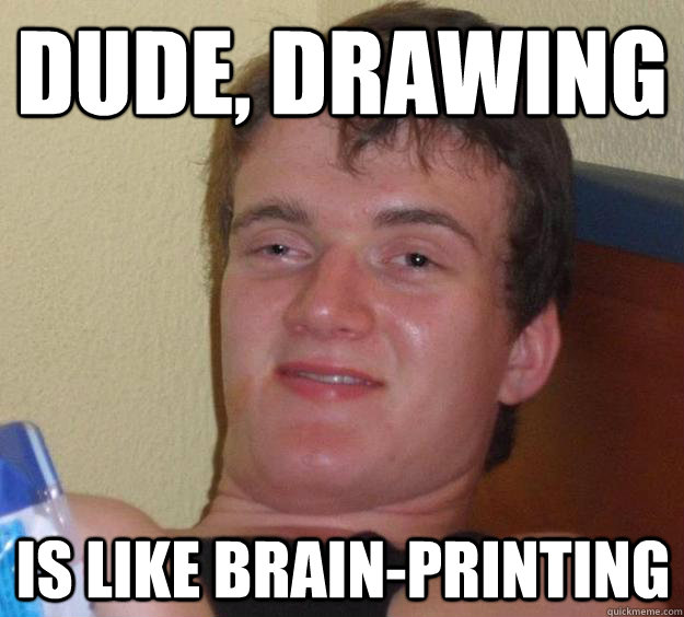
Drawing is Like...

Today's inspirational words.


Tuesday, October 23, 2012

Pascal Campion

 
I've been wanting to do a post on one of my favorite artists, Pascal Campion, since I started this blog. (My list of 'Favorite Artists' is by no means complete, since I've really only been exploring the art world in earnest since March or so - but still he's one of my favorite that I've come across.) I thought today would be a good day to do it since I listened to his interview on the Sidebar podcast during my run this morning.

Here's the video that first introduced me to his work.


Inspirational Artists: Pascal Campion from Onyx Cinema, Inc. on Vimeo.

This video really inspired me the first time I saw it, and I have since signed up for his sketch-a-day emails. It's extremely pleasant to wake up and open your email and see a colorful, delightful slice-of-life drawing among all the spam and work messages.


His drawings aren't epic, nor are they technically masterful, but I love them for that reason. They're little moments that make you remember that life is composed of these little day-to-day experiences that slip by you if you're not careful.


[I wish I knew how to format these so they were side-by-side... gotta pick up some tips from Kelly soon!!]

I love that he stresses storytelling in drawing. "It's not about how well you draw, it's what you say with your art." My CDA teacher (professor?) Peter Han said something similar about the redesign projects that we have to do this week - almost that it didn't even matter what you came up with as long as you had a good reason for drawing it. This is something I've been learning over time too, and it applies to every creative medium. When I was younger, I was determined to be an artist. That sort of evolved over time into writing, which turned into screenwriting in college, which then turned into editing. But the common thread that all of these art forms share is that storytelling is key. You want your story or your script or your TV show or your movie to intrigue the viewer - to open a window on a world, invite them to explore. To make them feel something. And it's exactly the same with art.


You can find more of Pascal's work and buy sketches of his prints on his website. And, as noted, his Sketch-a-Day Blog is amazing; definitely worth checking out.


Sunday, October 21, 2012

CDA So Far

This fall I've been taking a class called 'Vis Com 1: Dynamic Sketching' at the Concept Design Academy in Pasadena. It's challenging, but it's exactly what I was looking for in terms of a foundation-level art class. The hardest part is honestly the time commitment of the homework on top of having a full-time job (I've already missed a friend's birthday, a concert and a group outing), but I think I really needed something like this to make me buckle down and learn. The way things are going, I think by the end of the term I'll have learned as much as I would by myself in a year. The teacher and T.A. are absolutely outstanding, and my fellow classmates are really nice.

Here's some of the stuff they've assigned for homework - organic shapes with contours, dissections of those shapes, textures.


The basic goal of the course is getting you to recognize anything you see as a simple shape that you can start with - be able to describe the contours of the shape to show that you understand the form - and then refine from there with textures and lighting. From big and simple to small and detailed.


The 5 form relationships were a little difficult - trying to visually understand how the 5 simple shapes intersect with each other - but it's great practice.


I don't want to compare and contrast here - but here's an example of the same homework assignment from one of my classmates that I thought was really great. Isabella's WK 2 HW She's great at texturing, constrasting lights with darks and directing your eye to a focal point (all things I need to work on). Not to mention her 5 form relationship page is pretty epic and looks like an actual thing instead of just shapes all over the page...

For our first week of homework, we had to do a "How To" project - just to write and illustrate how to do something. Mine ended up being pretty Calvin and Hobbes inspired. (The pages of my actual sketchbook are square so it didn't totally fit on the scanner... but you get the idea.)


Here's another example of the How To project that I thought really hit the nail on the head, without even using words. Tim's How To

Yesterday we went to the Arboretum in Arcardia and drew lots of plants, which was fun... Plants are usually difficult for me, but this class is teaching me that you can draw anything, it's just a matter of breaking it down and organizing it in your mind. This week we have to draw more plants and do a plant-inspired, open-ended 'redesign' project... so wish me luck!

Friday, October 19, 2012

Letting the Learning Get in the Way

From the Drawn Blog today:
I’ve spent my entire career obsessively trying to “learn how to draw” when I should’ve just been drawing. Always thinking “I just need to get a little better… and then I’ll start working on (insert any of a hundred personal projects)”... The fact is that I’ve been good enough since my teens- and would’ve improved so much more rapidly had my study been in the service of any of those projects- and not in the dozens of sketchbooks pilled in my closet.
Lesson: Don’t use "learning" as an excuse to avoid "doing".
- Shane Glines
I had this exact realization last week when I had to do my 'How To' project for class. I was so scared of actually doing it, knowing it wouldn't come out as great as it looked in my head... thinking, "I'd be so psyched to draw this if I was just a little better and knew I could nail it." But then I did it, and it didn't actually look terrible, and I realized that if I just go ahead and draw all the things I want to draw without worrying about getting better first, I'll improve so much faster than I would if I just muck about doing exercises in my sketchbook without really finishing anything.

I'll be posting some of my own work tomorrow!! GET EXCITED, the 5 people who read this.

Wednesday, October 17, 2012

Paperman

From the Character Design Blog, here are some concept sketches and final frames from Disney's new short, Paperman!


I love these - so expressive while being INCREDIBLY line efficient. Simple is best!


 In particular, I love her hair. I always have a really hard time drawing hair. But on any given person, their hair tends to clump together into fairly distinct forms, and the artist simplifies the process by just drawing the outlines of these clumps. At a glance, you can tell exactly what her hair is doing, and it lends movement to the image. For example, in the sketch at the top left of the above image, the way the ends of her hair fan out tell you that she has just spun her head around to look in our direction. In the bottom left sketch, you can tell she has just leaned forward by the way her hair has partially slipped over her shoulder, but the rest is still being held back.

These things sound like no-brainers, but it's little stuff like this that brings a drawing to life.


 I also love that it's in black and white. Sometimes I struggle with getting my sketches to read without using color. But these last few frames are instantly understandable. And also beautiful! Basically, I'm more excited for this short than I am for Wreck-It Ralph (although I'm really excited about that too... way more excited than any self-respecting 20-something should be).

UPDATE 1/31/13: Disney Animation has posted the full short online!! Watch here:


Tuesday, October 16, 2012

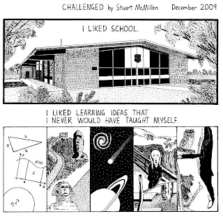
"Challenged" by Stuart McMillen

As a follow-up to yesterday's post, here's one of the things that originally inspired me to dive into this as much as I have.


When I found this back in March or April, it hit me really hard. I felt like it was written about me. I was starting to feel like I was floundering a little in my adult life. When I was younger, I was always working towards something... doing my homework, getting through the next text, finishing the next school year, graduating. And I loved learning. My brain flourished under the constant stimulation. When I graduated college and moved to L.A., my next goal was to get a job. And I did that. And then, for the first time in my life, I found myself with a routine that included a lot of free time where no one was telling me what to do.

This panel was the one that really got to me:


I looked at that and saw myself. All I was looking forward to was the next TV show or the next party. I wasn't actively working towards anything. And I have a tendency towards laziness. I want things to be easy. But the most challenging things are the most rewarding things.

So now... "With no one challenging me, I choose to challenge myself."

Monday, October 15, 2012

Rainn Wilson's Advice

Inspiration can come from anywhere... today's came from reddit, where Rainn Wilson did an AMA. Someone asked him what advice he would give to young actors trying to make it in the business.
"My advice to starting in the business is to TRAIN! STUDY! APPRENTICE! There's this myth that "I have talent" so I'm going to show up to LA and be famous. It's a craft that takes years (if not decades) to hone. I went to a 3 year acting school and then did 3 years of theatre touring, regional theatre and off and on broadway before I did any film or TV. And I studied the whole time. Find the best teachers/programs and work your ass off LEARNING for 10 years. Don't worry about fame. Worry about your art, your craft, your soul. That will lead to a rich, full life."
Obviously he was talking about acting, but I think this advice applies to any creative career. Any art is really a lifelong learning process. You're always improving. My all time favorite blog that I follow is Gurney Journey, the blog of James Gurney (the creator of Dinotopia). He's considered to be a modern master, but he is constantly posting about art history, color theory, the science behind how our brains interpret images... his learning hasn't stopped just because he's an established artist. He's forever expanding his knowledge to improve his craft.

I also keep running into a general notion that Rainn Wilson gets at - that 'talent' doesn't really exist. That being good at any creative craft takes a LOT of hard work. I do think there are people who are more naturally gifted than others. But I've also seen the results of years of hard work where originally there was no indication of talent. The most notable example of this that I've seen is Jonathan Hardesty's famous thread on ConceptArt.org... Here (note: this is not the link to the actual thread, which is hundreds of pages long... it's a summary post).


I like the end of Rainn Wilson's statement, too - "Don't worry about fame. Worry about your art, your craft, your soul. That will lead to a rich, full life." I think the study of any creative craft, and the honing of a skill in that craft, is an extremely rewarding process. Lately I'm trying to temper my expectations of how far I can go with concept art (Lead Character Designer at Dreamworks... yeah, probably not in the cards, actually not sure if that's even a real position or not), especially starting so late, and just trying to concentrate on the joy it brings to my own life. I've had two classes so far at the Concept Design Academy, and I love it... getting the chance to learn and grow and challenge myself is something I really enjoy. (Even if my own lack of skill drives me up a wall sometimes. My teacher, Peter Han, says mistakes are really important to make. I really... REALLY hope he's right. Because I fucking hate making mistakes.)

Friday, October 12, 2012

Due Tomorrow

Homework for Dynamic Sketching class is due tomorrow.

Monday, October 8, 2012

11 Second Club Winner - "Audition"

I've been a follower of the 11 Second Club, the monthly animation competition, for a while now. Each month, they provide a (roughly) 11-second sound bite from a film or television show, and then individual animators can download the clip and make an extremely short animation to it. They just released the winning September 2012 animation - "Audition."

All the winning animations are great, but this one in particular stands out to me. The acting and timing is superb. And the style of animation is really interesting - it looks like an intriguing combination of 2D and 3D animation. It reminded me of the finalized footage that I've seen from "Paperman", Disney's new animated short that will play before Wreck-It Ralph.


I do love 3D animation, but I (like everyone else in my generation) have a pretty bad case of nostalgia for the aesthetic of 2D... so to see the two being blended is a very exciting development!

Final note - here's another 11 Second Club winner that really stood out to me - "TV is Power"

Introduction

I'm making this blog because I want to chronicle my "artistic journey" that I seem to have set myself off on this year. I may be posting my own work here, but I mostly just wanted a place to gather the jumble of things that I read and see that inspire me (my "ART" bookmark folder is getting pretty overstuffed at this point). And I could use a centralized place to put down my various thoughts and ruminations on art and drawing. I also just started a class at the Concept Design Academy, so I'll be writing about my experience there as well. And anything else that comes to mind.

I've subscribed to so many blogs by this point, read so many art books, and watched so many YouTube tutorial videos that I'm beginning to run into the same advice over and over. The chief one seems to be to just draw and draw and draw, all the time, everything, and think of all the bad drawings as dues paid, as steps towards a higher skill level. This post that I came across today spoke to that - "Draw Like a Six-Year-Old", by Phil McAndrew

Draw a lot, and draw with pleasure. I definitely get so wrapped up in trying to make a drawing good that I forget to enjoy the process. And that fear of 'messing up' is still with me, even when I'm by myself with nothing but my cheapest sketchbooks. Things to overcome.